Loading…

What to Measure on Guest WiFi, and What to Ignore
By weirdtoo·September 28, 2026·12 min read
Watch seven actionable guest WiFi metrics—connection success, outages, per-zone load, peak per-user speed, latency, and portal completion.
What to Measure on Guest WiFi, and What to Ignore
Most guest WiFi dashboards are lying to you by drowning the useful stuff in junk. If you run a bar, café, gym, or small venue, I’d watch 7 numbers and ignore the rest: connection success, outage time, device load by area, per-user speed at busy times, latency, portal completion, and support issues by type.
Here’s the short version:
- Access first: can guests join, get an IP, load the portal, finish sign-in, and stay online
- Use by zone and time: venue-wide averages hide the patio that dies every Friday at 7:00 p.m.
- Speed is not enough: a line can test fine and still feel broken from high latency or packet loss
- Portal friction matters: if people start the login flow and quit, the join process is the problem
- Ignore vanity stats: raw device totals, total data used, and average session time often tell you nothing useful
If a metric does not point to one owner and one next step, I’d stop tracking it. That chart is not helping. It is wall art with WiFi labels.
| What I’d watch | What it tells you | What to do if it slips |
|---|---|---|
| Connection success rate | Whether guests can get online at all | Check coverage, DHCP, DNS, and AP health |
| Outage duration + count | Whether service fails at bad times | Log when, where, and why it failed |
| Device count by zone | Whether one area is overloaded | Check crowded APs and heavy users |
| Per-user speed at peak | Whether busy hours wreck service | Limit hogs or add capacity |
| Latency + packet loss | Why WiFi feels slow even when speed looks fine | Check line health and AP settings |
| Portal completion rate | Whether guests get stuck in sign-in | Cut fields, test code delivery, fix flow |
| Support issues by category | What staff and guests keep running into | Tie each complaint to a first check |
That is the whole job: measure what leads to a fix, skip what just fills a dashboard, and break every number out by place and time. Otherwise you get a pretty average and an angry table in the back.
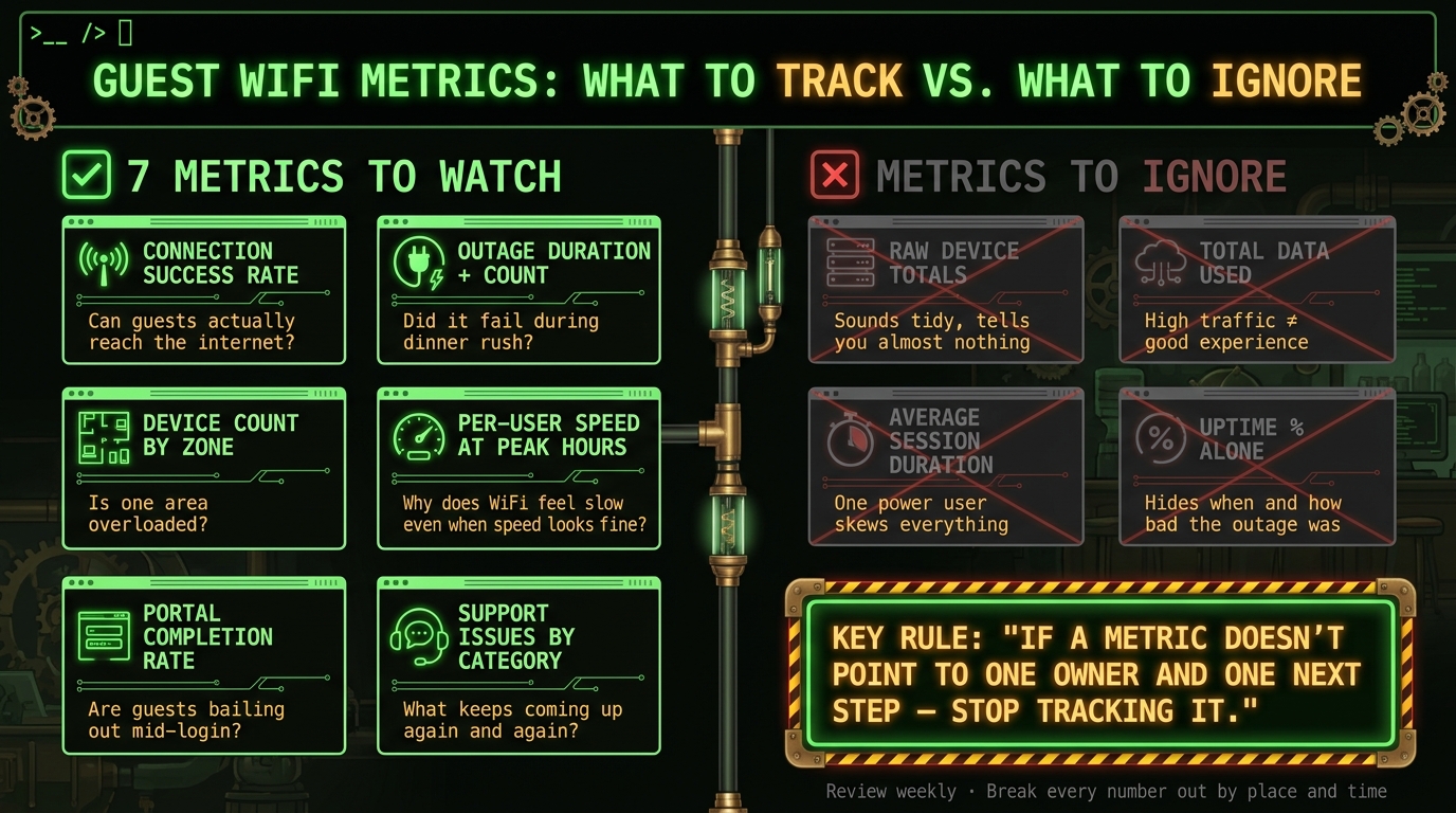
Guest WiFi Metrics: What to Track vs. What to Ignore
Measure access first: can guests join and get online
Start with the path the guest takes, in order. Not your dashboard. Not the vendor's happy green status light. The actual path.
Join. Get an address. Reach the portal. Authenticate. Stay connected.
Measure each step on its own: join, address assignment, portal load, authentication, and session stability. If you lump it all together, you learn nothing. "WiFi is down" could mean weak coverage, a bad DHCP lease, DNS falling over, or a portal that loads like it's dragging itself uphill.
Connection success rate and where failures happen
Connection success rate is not "how many phones connected to the SSID." That number lies by omission. What matters is how many devices tried to join and actually reached the internet.
Split failures by stage and location. Yes, both. If the back patio fails at join, that's a coverage problem. If the whole place joins but never gets an IP, look at DHCP. If guests get online halfway and then stall at the splash page, the portal is the problem, not the radio.
That split is what lets you separate coverage issues from DHCP/DNS trouble and portal trouble, instead of guessing and restarting things until the pain stops.
Uptime, outage duration, and incident count
Once access works, track whether it keeps working.
A single monthly uptime percentage can hide the mess. Ninety-nine percent uptime sounds nice until you learn it came from a handful of ugly outages during dinner rush. So track these together:
- Uptime percentage
- Outage duration per incident
- Incident count
For each outage, log the start time, end time, affected zone, and cause. Otherwise every failure becomes "internet weirdness", which is not a diagnosis. It is a shrug.
Device count and portal completion without fooling yourself
Use concurrent devices to see peak load. Use unique devices per day or week to watch demand trends. And don't treat device count like a people counter. It is a load signal, not a headcount.
Pair device count with captive portal completion rate. That is where the lie detector kicks in.
If portal completion drops while demand stays flat, the access flow is broken or annoying enough that people bail out. If demand falls too, you're probably looking at a bigger access or coverage problem.
The table below maps each step in the connection flow to what a drop at that step usually means:
| Stage | What It Measures | If It Drops, Suspect |
|---|---|---|
| Connection attempts | Devices trying to join the guest network | Association problem |
| Successful network access | Devices that got an IP and DNS | DHCP or DNS failure |
| Portal page loads | Devices that reached the splash page | Captive portal load issue |
| Completed authentication | Guests who finished the sign-in step | Authentication friction |
| Sessions that drop before sign-in completes | Devices that dropped before finishing | Upstream or backhaul issue |
Use that flow to find the first failing step before you look at anything else. If step two is broken, step four will look bad too. That's not two problems. That's one problem wearing a fake mustache.
sbb-itb-342b8b2
Measure usable performance, not just whether the network is technically up
Once guests can connect, the next question is simple: does the WiFi still work when the room fills up?
A network can be "up" on paper and still be miserable to use.[1] Guests do not say, "your latency profile has degraded." They say the video buffers, the card reader hangs, or the WiFi just does not work. That is the layer that matters. Not theory. Not the ISP ad. The part where actual people try to use the thing at the same time.
Bandwidth per user during peak hours
Measure peak-hour throughput per guest. Not the total pipe. Not the speed your ISP promised on a flyer.
This is where people fool themselves. A 500 Mbps connection sounds great until one person starts a huge download and everyone else gets soup. If service falls apart at 8:30 p.m., check what each guest is getting during that window.
Use a scanner to spot unusually heavy users during peak hours before you decide to buy more capacity. Sometimes you do need more internet. Sometimes one device is acting like it owns the place.
Latency and packet loss explain complaints that the network feels slow or unreliable
Speed tests can look fine while the network still feels broken. That is not weird. It is common.
Latency and packet loss explain a lot of "the WiFi is slow" complaints. High latency makes video calls choppy and interactive apps annoying even when download speeds look okay. Packet loss does the same kind of damage in a different way. The connection may test fast, then act flaky the moment someone tries to do anything live.
Look at those numbers with throughput, not by themselves. A clean speed test does not cancel out bad latency. Guests care about whether Instagram loads, whether FaceTime stutters, whether the payment app freezes at the worst moment.
Signal quality and access-point load are diagnostic tools, not headline numbers
Signal readings and access-point load are for troubleshooting. They do not belong on the big weekly dashboard unless something is wrong.
If one area keeps underperforming, use a scanner to check which devices are stuck on the overloaded access point and whether the issue is the channel or radio placement. If one access point is carrying most of the clients while the others sit half-empty, the radio layer is probably overloaded.[1]
That is the annoying part of WiFi. The problem is not always "bad internet." Sometimes the internet is fine and the room is the mess.
If throughput, latency, and signal all look okay but guests still complain, stop staring at RF charts. The next thing to check is portal friction and support demand.
Measure portal friction and support demand so staff are not guessing
When access works and throughput looks normal, the next failure point is usually the portal. Good signal does not help much if a guest gets stuck before they finish sign-in.
Track two things at each step of the flow: abandonment and authentication time. Do it for load, consent, contact entry, code delivery, and sign-in.
Abandonment rate tells you how many people started and then bailed. Authentication time tells you whether the problem is the portal itself or the code delivery step dragging its feet.
Split completion rates by method. Email and SMS break in different places, so lumping them together hides the problem. If SMS codes fail more often than email, that is not mystery fog. It is a thing you can check and fix.
Support issue trends that show what guests and staff are dealing with
Front-desk staff should not have to play WiFi detective. If a guest cannot connect, "it seems weird today" is not a support process.
Log complaints by category instead of just counting total issues. Use these buckets:
- cannot see the network
- portal will not load
- code never arrived
- connected but no internet
- slow service
Then track how often each one shows up and whether it repeats. One complaint is noise. The same complaint five times in a day is a pattern, and patterns are where the work starts.
If the same guest keeps getting locked out or hit with verification prompts, assign one person to deal with those prompts and clear stale device connections. Otherwise two staff members will poke at the same mess from different angles and call it troubleshooting.
Map complaints to the metric that should trigger action
Staff complaints need to point somewhere. Once complaints are sorted into categories, tie each one to the metric that should move. That turns "the WiFi is acting up" into an actual first check.
| Complaint | Related Metric | First Check |
|---|---|---|
| "I never got the code" | Method-specific failure rate | Check whether the code reaches the right email or phone number, and how long delivery takes. |
| "The portal won't load" | Portal load time, captive portal completion rate | Test the portal on a fresh device and note where the flow stalls. |
| "Connected but no internet" | Internet access after login, latency | Confirm the guest actually made it past authentication and into internet access. |
| "The WiFi is slow" | Bandwidth per user during peak hours, latency | Check peak-hour performance. |
| "I keep getting locked out" | Authentication friction, verification prompt rate | Check who is receiving the verification prompt and whether stale device connections need cleanup. |
Only track complaints that lead to a fix. If a metric never changes what you do next, it is just dashboard wallpaper.
What to ignore, and the short scorecard to check every week
Numbers to treat as secondary or skip unless they drive a decision
After access, performance, and portal friction, the rest of the metrics should earn their place. If they do not point to a fix, they are just noise with a spreadsheet.
Raw connection volume is the big one to ignore. “327 devices connected last week” sounds tidy. It tells you almost nothing. Were people failing to connect? Did service crawl at 8:30 p.m.? Did three tables complain? Without that, the number is just wallpaper.
Total data used has the same flaw. A packed bar can chew through a lot of traffic and still leave guests staring at a page that will not load.
Average session duration looks useful until one guy parks a laptop on your WiFi from lunch to close and wrecks the average for everyone else.
Uptime on its own misses the ugly part: when the outage hit and how long it lasted. Ten minutes down at 3:00 a.m. is not the same as ten minutes down during trivia night.
Use these for reporting if you want. Fine. Just do not let them crowd out the numbers that tie to a fix.
A short guest WiFi scorecard for a small venue
Most small venues can check this once a week without an IT person on payroll. Keep the list short. Each metric should lead to one next step. Otherwise the review turns into a small ritual of looking concerned and doing nothing.
| Metric | Review Frequency | Action Trigger |
|---|---|---|
| Connection success rate | Weekly | If it drops in one zone or during busy periods, investigate coverage or network capacity in that area |
| Uptime and outage duration | Weekly | Log any outage and identify the cause; repeated or prolonged outages need escalation |
| Concurrent devices and stale devices | Weekly | If the count spikes without a matching event, scan for unauthorized devices with a tool like Fing [1] |
| Per-user throughput during peak hours | Weekly | If guests report slowdowns when the venue is full, check AP load and channel use |
| Latency and packet loss | Weekly | If pages feel slow or apps stall, check the ISP line and AP settings |
| Captive portal completion rate | Weekly | If many guests abandon the portal, test the flow on a fresh device |
| Authentication time by method | Weekly | If logins or verification codes are slow or failing, check provider status and fallback options |
| Support incidents by category | Weekly | If the same complaint keeps coming back, treat it as a pattern and investigate |
Conclusion: track what leads to a fix
Track metrics that lead to an action. Ignore metrics that only describe traffic. If a number never changes what you do next, it does not belong in the weekly review.
FAQs
How do I measure connection success correctly?
Track the ratio of successful associations to total connection attempts. That number tells you where people are getting stuck: the first handshake, login, or the captive portal.
Device counts on their own are a trap. A phone can see the network and still never get online. What matters is the full path from signal detected to live internet access.
Watch the drop-offs by:
- device type
- time of day
That is where the ugly stuff shows up. Maybe older Android phones choke on the portal. Maybe the lunch rush overloads a setting that looks fine at 3:00 PM. Maybe iPhones connect, hang, and quietly give up.
This is not abstract. It is how you spot config problems instead of blaming "bad WiFi" like a caveman with a router.
What counts as a good portal completion rate?
The search results don't give a benchmark here. There is no clear industry standard in the material for what counts as a good guest WiFi portal completion rate.
Plain English: if you were hoping for a neat number like 35% or 60%, it is not in the source. Anyone pretending there is one from these results is making it up a bit.
When should I ignore average session time?
Ignore average session time when it does not change what you do next.
A guest at a bar might stay on WiFi for 12 minutes while they check the menu and pay the tab. A hotel guest might stay on for 6 hours because they fell asleep with Netflix still running. Same network. Wildly different session times. The number by itself tells you almost nothing.
This is why average session time often turns into a vanity stat. It looks neat in a dashboard. It does not tell you whether the network feels fast, whether people can get online, or whether your setup is falling apart during the dinner rush.
Watch the stuff that points to an actual fix:
- Connection success rate: Can people get on without retrying three times and swearing at their phone?
- Latency: Does the network respond fast enough to feel normal?
- Bandwidth per user: When the room fills up, does each person still get enough to do the basics?
Those numbers lead somewhere. Session time usually doesn’t.
Current contact path
Need Weird Network WiFi, custom apparel, or scoped help?
Use the contact form; removed product, checkout, research, and newsletter funnels stay offline.