Loading…
The Splash Page Checklist for Bars and Cafes
By weirdtoo·September 19, 2026·9 min read
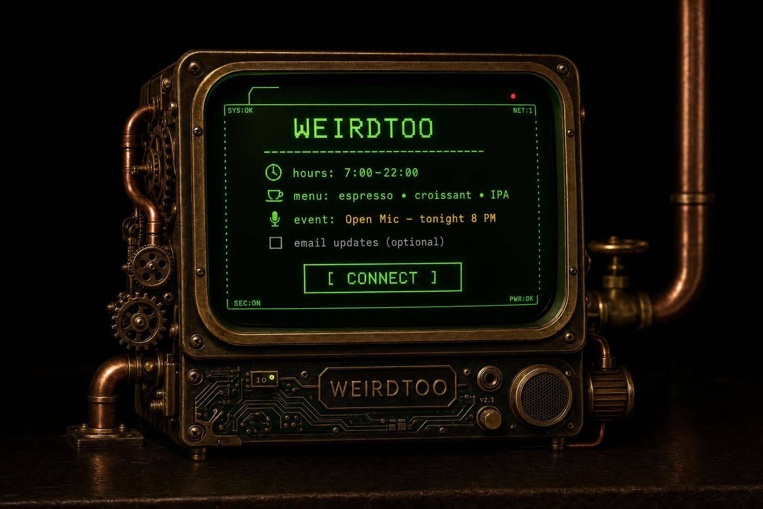
Fast, one-screen Wi-Fi logins for bars and cafes: show hours, 2–3 menu items, one event, and keep opt-ins optional.
The Splash Page Checklist for Bars and Cafes
If your Wi-Fi page makes people scroll, type too much, or trade an email for internet, it is doing the job wrong. I’d keep it to one phone screen, one main connect button, today’s hours, 2 to 3 menu picks with prices, one event or special, and footer links for policy pages. That is the whole deal.
Here’s the short version:
- Put your name and logo first so guests know they joined the right network.
- Make the login step obvious with one main button or one short field.
- Show useful stuff next: hours, a few menu items, prices, and tonight’s event.
- Keep email/SMS opt-ins separate from Wi-Fi access and leave them unchecked.
- Add policy links in the footer: Privacy Policy, Cookie Policy, Terms of Service, and Acceptable Use Policy.
- Use a basic router page if all you want is access.
- Use a venue Wi-Fi tool if you want promos, list growth, and repeat-visit data.
A few hard numbers help here. On mobile, people often bounce if a page feels slow after 3 seconds. And more than 60% of web traffic in the U.S. comes from phones, so if your splash page is clumsy on mobile, that is not a small bug. It is the main problem.
| Part | What I’d put there | Why it stays |
|---|---|---|
| Top of page | Venue name, logo, location cue | Confirms they are in the right place |
| Main action | Connect button or short access step | Gets them online without drama |
| Below login | Hours, top items, prices, one event | Gives them something they can use now |
| Optional area | Email or SMS signup, unchecked | Lets you ask without blocking access |
| Footer | Policy and use links | Covers the legal bits without eating the screen |
If you are handing out the password on a napkin, you are not running Wi-Fi. You are wasting the one moment when a guest is already looking at their phone and waiting. That is the uncomfortable part.
Customize WiFi Login Page WITHOUT CODING - Classic Hotspot by Tanaza
sbb-itb-342b8b2
The core splash page checklist
Keep this page short. Not "minimalist" short. Useful short. A guest wants Wi-Fi, not a scavenger hunt.
Start with identity. Then the connect step. Then the few details people might use before they order another drink.
| Checklist Item | Job | Priority |
|---|---|---|
| Venue name & logo | Confirms guest is on the right network | Must-have |
| One connect button | Faster login, less friction | Must-have |
| Hours and top menu items with prices | Drives immediate orders and repeat visits | Must-have |
| Events & specials | Increases attendance on specific dates | Must-have |
| Optional email/SMS signup | Builds your marketing list | Optional |
| Social media links | Encourages follows and shares | Optional |
1. Branding and venue identity
Put your venue name and logo at the top. Fast. Guests should know in under two seconds that they joined your network, not the coffee shop next door or some random open hotspot.
A clean logo, your venue name, and matching colors do the job. Nothing fancy needed. Just clear.
If you run more than one location, add a neighborhood cue or street address under the logo. "The Rusty Nail - Wicker Park" does more work than just "The Rusty Nail" when someone is half-distracted and checking whether they tapped the right network.
2. Wi-Fi access instructions that fit on one screen
The connect step should fit on one phone screen. No scrolling. No hide-and-seek.
Whether it is one "Connect" tap or a short password field, the whole login step needs to stay visible on a standard phone screen. Every extra field is another small reason for someone to give up, put the phone away, and ask the bartender instead. Not ideal.
If you ask for email or SMS, put it below the connect button and mark it optional. Guests should be able to get online without giving you anything. The opt-in is a bonus, not a toll booth.
3. Hours, menu items, specials, events, and contact links
After the connect step, keep the rest of the page locked on what a guest can use right now.
That usually means today's hours in standard U.S. format, like Mon–Fri 11:00 AM–11:00 PM, two or three top menu items with prices, and one upcoming event that is worth a look. A live jazz night. Thursday trivia at 7:00 PM. Weekend brunch at $14. Real details. Not fluff.
Skip the full menu on the splash page. It is too much. Link to it instead. One "See Full Menu" button keeps the page clean and gives curious people the next step.
You can also add your Instagram handle or a direct link to your social profile if that is where you post specials or event updates. When guests are already staring at their phone, a follow is not a bad ask.
Email, SMS, and legal items
This is the part people either overdo or fake. Both are bad.
You need the consent and policy bits after the connect step and venue details. Not because anyone loves legal copy. Because this is the part that protects the guest and the venue without turning the splash page into a paperwork trap.
The job is simple: keep Wi-Fi access easy, and keep repeat marketing above board.
Keep Wi-Fi access separate from marketing consent
Do this with zero ambiguity before access is granted:
- Wi-Fi access: free to connect. No marketing required.
- Marketing opt-in: separate, unchecked, clear, and optional.
Do not tie marketing opt-in to Wi-Fi access. That trick gets abused all the time, and people notice. If someone just wants internet to check the score or send a photo, let them do that.
Use plain labels. Not legal soup. Something like: Text me monthly specials - optional.
That works because it says what happens, how often, and that the person can ignore it.
Show terms, acceptable use, and privacy basics
Keep the privacy summary short. Say what data you collect, why you collect it, and who collects it: your venue or your Wi-Fi provider.
Then link out to the full Privacy Policy, Cookie Policy, and Acceptable Use Policy.
Your acceptable use note should say a few plain things:
- The network is for personal use.
- Illegal activity is not allowed.
- Heavy bandwidth use may be limited if it starts wrecking the connection for other people.
That is enough for most splash pages. No one is there for a law seminar.
These items work best when they stay visible without making the page harder to get through. That is the trade-off. Cover the legal ground, but do not make a person fight a wall of text just to get online.
Design and platform choices that affect results
Bar & Cafe Wi-Fi Splash Page: Basic Router vs. Venue Platform
Once the content is set, design and platform choice decide whether anyone uses the thing. Good copy dies on a slow page. That is the boring truth.
Keep the page mobile-first, fast, and readable
Most guests open the splash page on a phone. Often in low light. Often on weak signal. Sometimes with one bar and half their patience gone.
The job is simple: let them scan fast and tap fast. If the page drags, or the text is tiny, or the button sits below a wall of nonsense, they leave before they connect.
Design is not decoration here. It either helps the guest read and tap at once, or it gets in the way.
When a basic router page is enough and when to use Weird Network or a similar tool
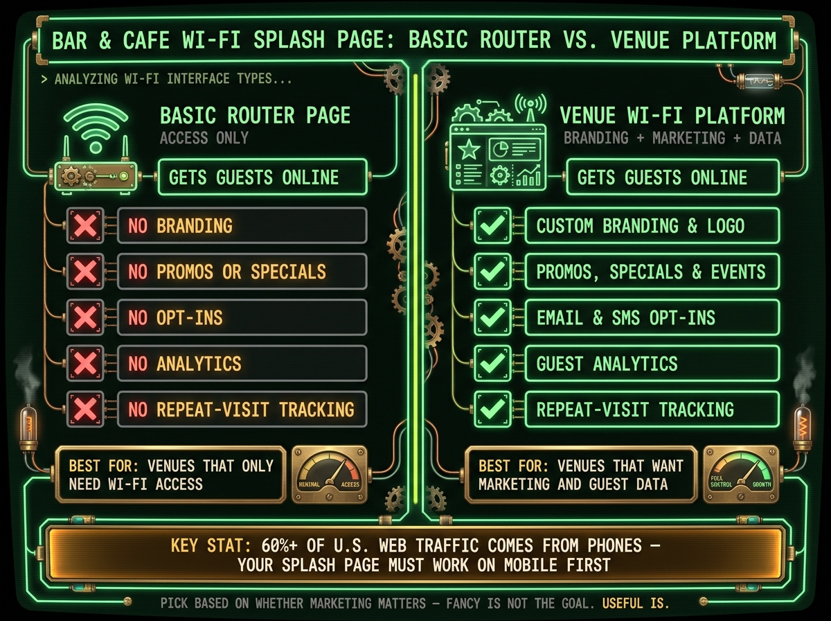
A basic router splash page does one job: get guests online. That is it. No branding. No promos. No opt-ins. No analytics.
If you need the page to do more, the basic router page runs out of road. Say you want to show tonight's specials, collect an email address, or push Thursday trivia night. That is where Weird Network or a similar venue Wi-Fi tool starts to make sense. Weird Network adds branding, promos, and opt-ins to guest Wi-Fi, plus guest analytics and repeat-visit tracking.
This is the trade-off:
- Basic router page: access only
- Venue platform: branding, promos, opt-ins, analytics
- Use case: pick based on whether marketing matters
The right tool is the one that fits the checklist without slowing the guest down. If all you need is access, use the router page. If you want branding and opt-ins, use a venue platform. Fancy is not the goal. Useful is.
Conclusion: A clear standard for a better splash page
For a bar or cafe, the splash page has one job. Get people online fast, then show them the stuff they care about.
The first screen should be fast, obvious, and useful. No maze. No fake choices. No "engagement" nonsense while someone is standing at the counter with a dying phone.
Keep marketing opt-ins separate, optional, and below Wi-Fi access. If you stick an email checkbox in the path to getting online, people will smell the trick. They are usually right.
Put Privacy Policy, Cookie Policy, Terms of Service, and Acceptable Use Policy links in the footer. They need to be there. They do not need to take over the page.
Use this as the final screen standard:
| Element | Placement | Required |
|---|---|---|
| Login button or access step | Primary screen, most prominent | Yes |
| Hours, specials, or tonight's event | Below login | Recommended |
| Marketing opt-in | Separate checkbox, clearly labeled | Optional |
| Privacy Policy, Cookie Policy, Terms of Service, Acceptable Use Policy | Footer links | Yes |
If the login stays prominent, consent is kept separate, and the page shows the current details guests actually need, it is ready. Everything else is noise.
If guests can connect fast and then see what matters next, the splash page is doing its job.
FAQs
How do I keep a splash page on one phone screen?
Stick to the basics. Keep the layout tight so people do not have to scroll just to get online. Put venue branding, clear Wi-Fi steps, and one call to action on the page. That call to action can be an email signup or SMS signup. Not both. Pick one.
Keep the design minimal. Skip long paragraphs. On a phone, big chunks of text are where good intentions go to die. The page should work fast, look clean, and make the next step obvious.
What legal links does a bar or cafe Wi-Fi page need?
A bar or cafe Wi-Fi splash page needs plain legal terms. Not because anyone loves reading them. Because if a guest does something dumb on your network, you want the rules posted before they get online.
Standard practice is simple: add a clear link to your Terms of Service or Acceptable Use Policy on the splash page. Put it where people can see it before they connect, not buried like a bad surprise.
Those terms usually cover:
- what the guest is responsible for
- what they are not allowed to do
- a liability disclaimer
Keep it easy to find and easy to open. If someone has to hunt for it, it may as well not be there.
When should I use a basic router page vs. a venue Wi-Fi platform?
Use a basic router page if your place is quiet, your setup budget is thin, or you just need guest Wi-Fi behind a password. It does the simple job. People get online. You move on. If you do not need customer data or promo tools, that is usually enough.
Use a venue Wi-Fi platform when you want the login screen to do some work for you. That means collecting email or SMS signups, pushing specials, or tracking repeat visitors. You get the captive portal stuff a plain router page does not give you, and the guest experience feels more put together instead of looking like an afterthought.
Current contact path
Need Weird Network WiFi, custom apparel, or scoped help?
Use the contact form; removed product, checkout, research, and newsletter funnels stay offline.